利用python畫出AUC曲線的實例
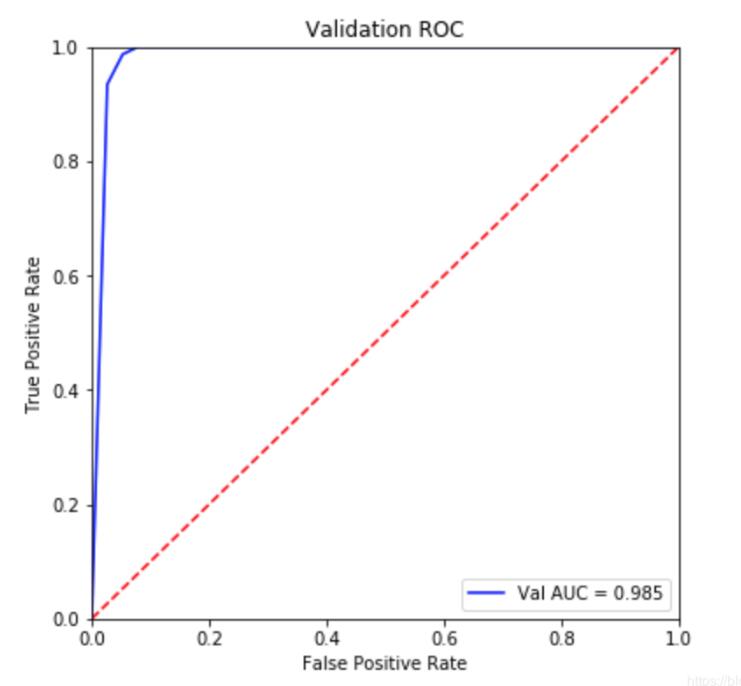
以load_breast_cancer數據集為例,模型細節不重要,重點是畫AUC的代碼。
直接上代碼:
from sklearn.datasets import load_breast_cancerfrom sklearn import metricsfrom sklearn.ensemble import RandomForestClassifierfrom sklearn.model_selection import train_test_splitimport pylab as pltimport warnings;warnings.filterwarnings(’ignore’)dataset = load_breast_cancer()data = dataset.datatarget = dataset.targetX_train,X_test,y_train,y_test = train_test_split(data,target,test_size=0.2)rf = RandomForestClassifier(n_estimators=5)rf.fit(X_train,y_train)pred = rf.predict_proba(X_test)[:,1]#############畫圖部分fpr, tpr, threshold = metrics.roc_curve(y_test, pred)roc_auc = metrics.auc(fpr, tpr)plt.figure(figsize=(6,6))plt.title(’Validation ROC’)plt.plot(fpr, tpr, ’b’, label = ’Val AUC = %0.3f’ % roc_auc)plt.legend(loc = ’lower right’)plt.plot([0, 1], [0, 1],’r--’)plt.xlim([0, 1])plt.ylim([0, 1])plt.ylabel(’True Positive Rate’)plt.xlabel(’False Positive Rate’)plt.show()
補充拓展:Python機器學習中的roc_auc曲線繪制
廢話不多說,直接上代碼
from sklearn.metrics import roc_curve,aucfrom sklearn.ensemble import RandomForestClassifierimport matplotlib.pyplot as pltfrom sklearn.model_selection import train_test_splitx_train,y_train,x_test,y_test=train_test_split(x,y,test_size=0.2)rf=RandomForestClassifier()rf.fit(x_train,y_train)rf.score(x_train,y_train)print(’trainscore:’+str(rfbest.score(x_train,y_train)))print(’testscore:’+str(rfbest.score(x_test,y_test)))y_score=rfbest.fit(x_train,y_train).predict_proba(x_test) #descision_function()不可用print(type(y_score))fpr,tpr,threshold=roc_curve(y_test,y_score[:, 1])roc_auc=auc(fpr,tpr)plt.figure(figsize=(10,10))plt.plot(fpr, tpr, color=’darkorange’,lw=2, label=’ROC curve (area = %0.2f)’ % roc_auc) ###假正率為橫坐標,真正率為縱坐標做曲線plt.plot([0, 1], [0, 1], color=’navy’, lw=2, linestyle=’--’)plt.xlim([0.0, 1.0])plt.ylim([0.0, 1.05])plt.xlabel(’False Positive Rate’)plt.ylabel(’True Positive Rate’)plt.title(’Receiver operating characteristic example’)plt.legend(loc='lower right')plt.show()
以上這篇利用python畫出AUC曲線的實例就是小編分享給大家的全部內容了,希望能給大家一個參考,也希望大家多多支持好吧啦網。
相關文章:
 網公網安備
網公網安備